Adding a little color to proceedings
The technical side of the bike is underway, and the parts have been ordered so with that we switched to a different lane. Obviously when building a bike, we look at performance, weight, enjoyability and all those things. This other path though is all about aesthetics! What is better than a fast motorcycle? A fast motorcycle that looks the business!
So with that, we contacted some new friends of ours at Printlab Wraps, out of our local town of Lakeville, MN. With some of our other custom builds we have gone full paint through characters like BC Customs out of North Minnesota. When going that route we inevitably always end up with premium design and artistry. With other we have gone over a combination of carbon fiber, OEM, and subtle additions to compliment both. Thsi time though we wanted to try something new and go in with a different perspective and different goals. For the Challenger we want to highlight RydeCulture itself and compliment it with all our aftermarket alignments. For this that can only mean one thing….
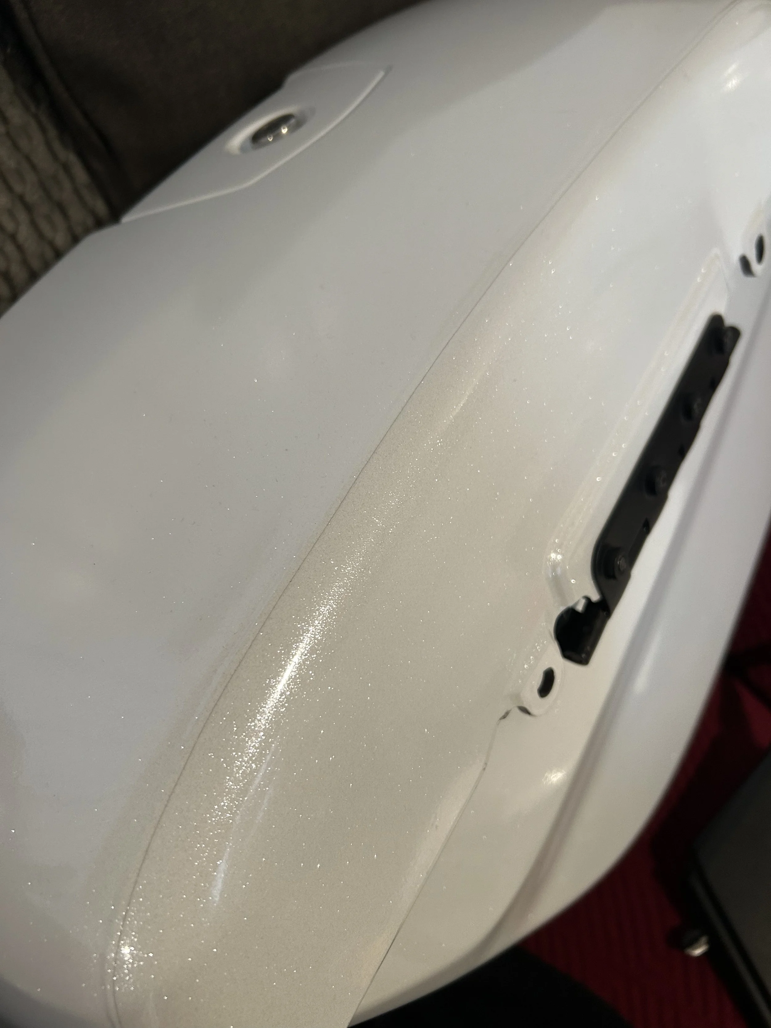
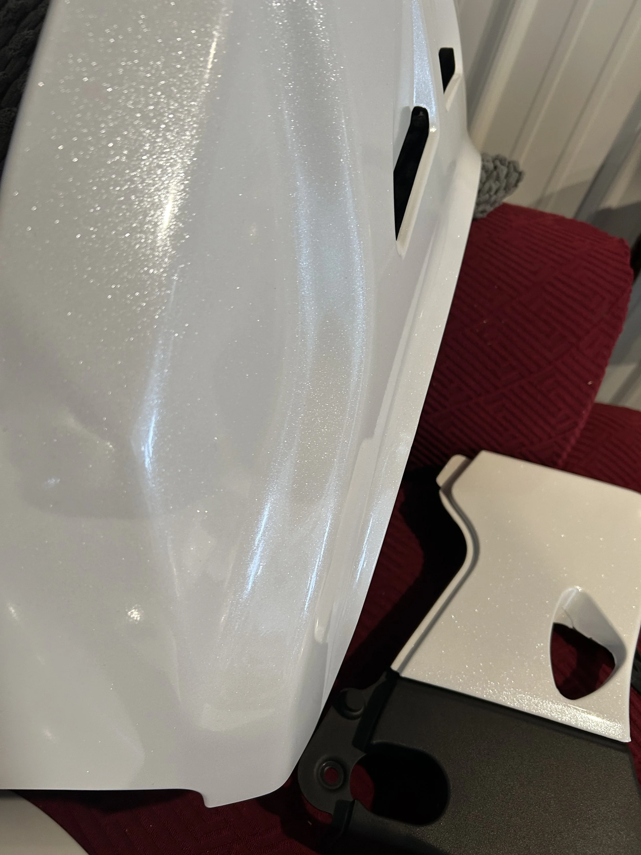
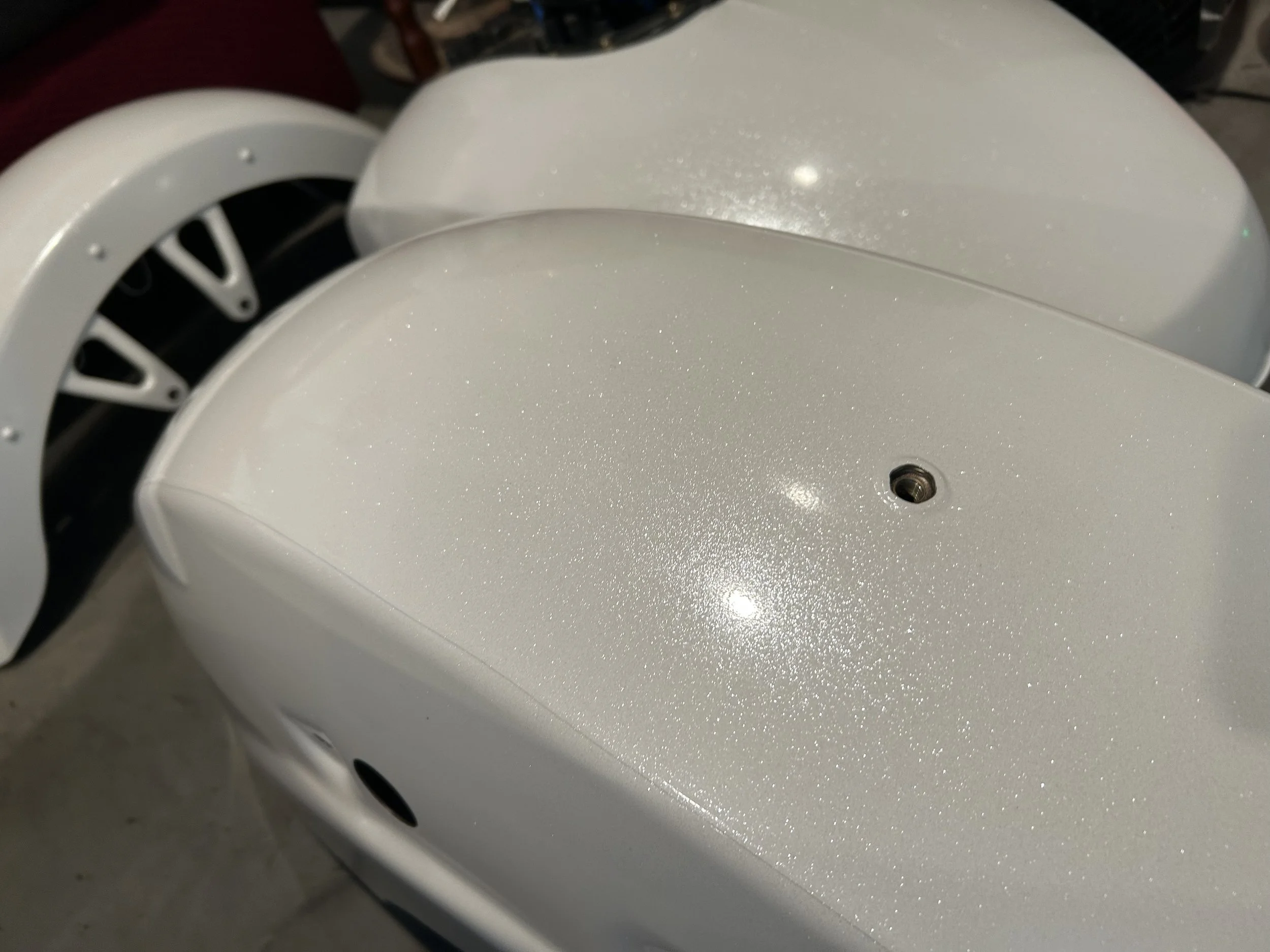
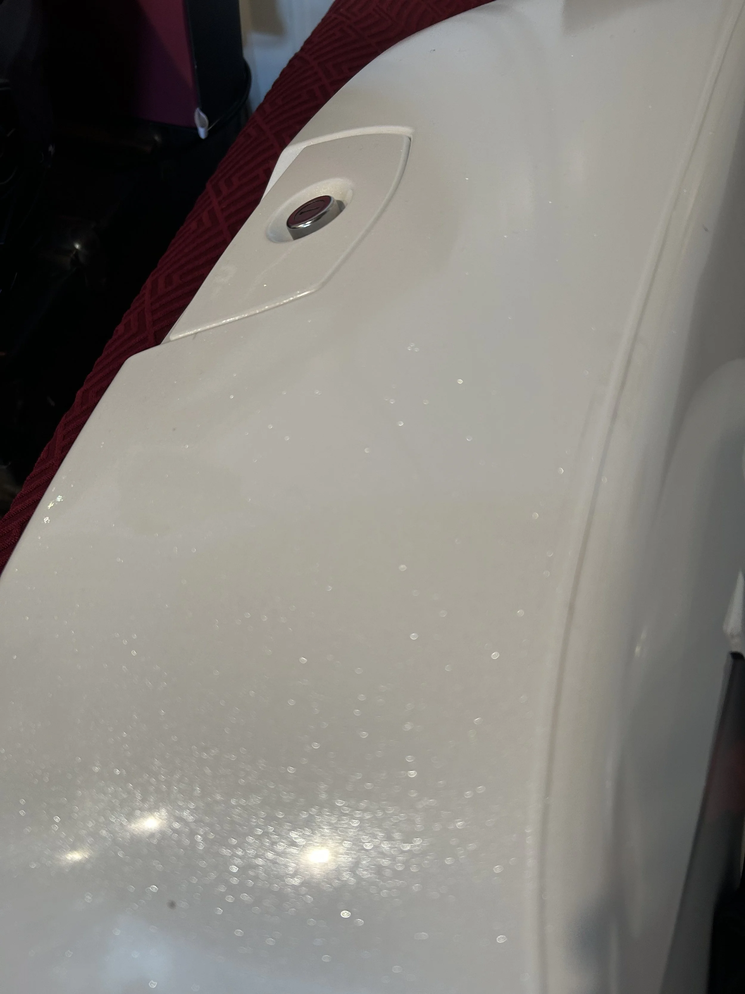
A base color scheme to suite our standard logo background. White. But upgraded to some high-quality shiny stuff that in sunlight looks totally amazing. These photos will not show that, only hint at it. You’ll see that upon completion…
Eventually you will see all the next layer pieces. RydeCulture circle logo proudly emblazoned and the other logos complimenting. By the time you see us riding around in Sturgis you will know exactly who is riding around and who we represent. But for now, here is a first look.